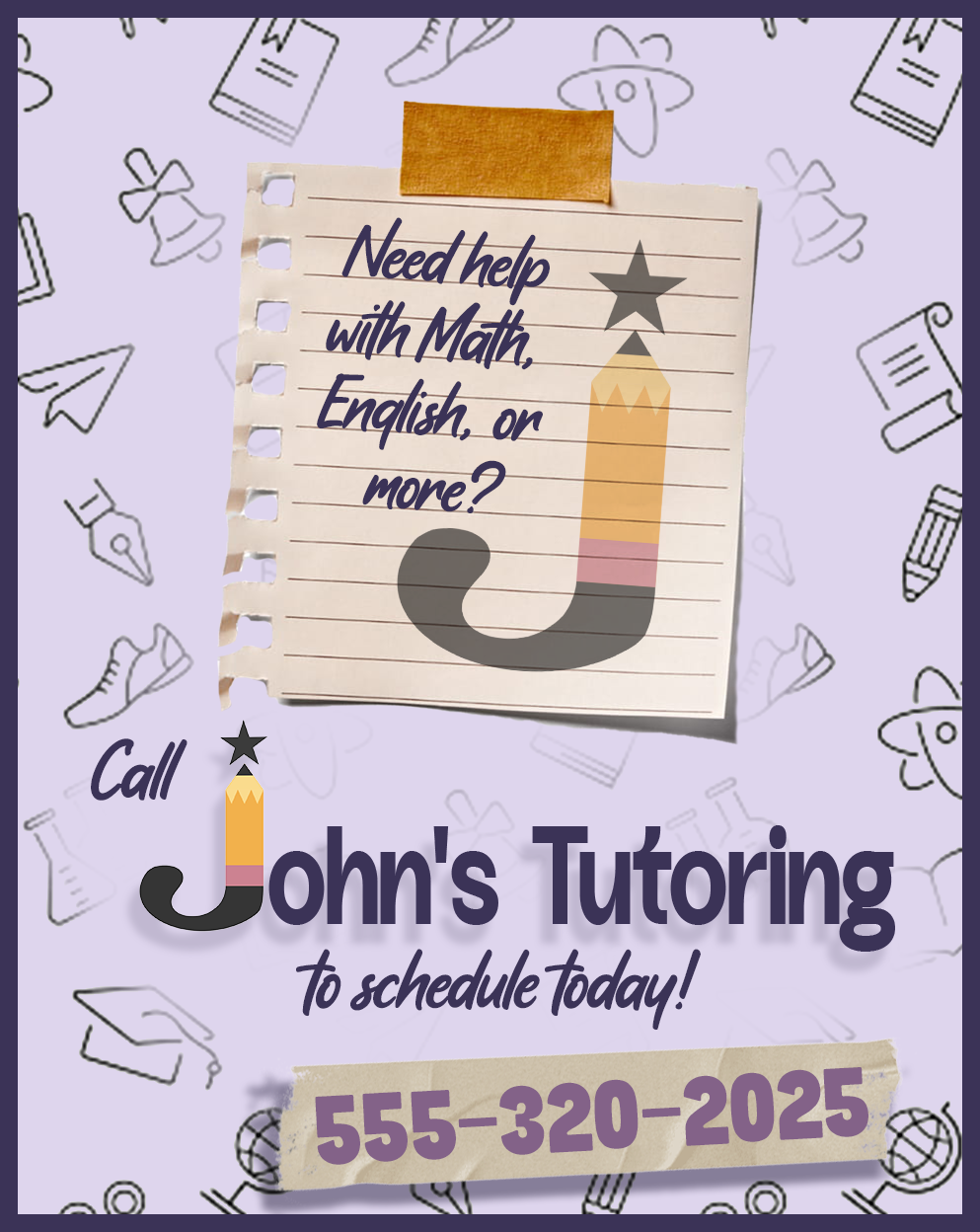
From a story of struggle, to a symbol of strength
A logo for a brother who uplifts others
This concept is deeply personal to me and my brother, because his journey with dyslexia inspired the visual direction and purpose of the design. For years, his dyslexia was disregarded and undiagnosed by school officials who refused to treat John’s struggles as anything more than an attention problem. But his natural inclination to help others led me to a tutoring service where he looks out for other students.
The pencil logo encapsulates flexibility and determination, with the tip reaching towards the coveted symbol of academic excellence—a star. This project challenged me to merge personal storytelling with professional branding principles, using simple symbolism to convey empathy, intelligence approachability.
This project was created for a logo letterform assignment, where each student designed a brand identity symbolized by a single letter. I chose the letter J for my brother John, and developed a hypothetical tutoring business that supports students with dyslexia.